In the ever-evolving landscape of website design, staying ahead of the curve is crucial for attracting and retaining clients. As we look towards 2024, several exciting trends are set to redefine the digital experience. Embracing these trends not only ensures your website stays visually appealing but also positions you as a forward-thinking and client-focused designer.
1. Immersive 3D Elements: Beyond the Screen
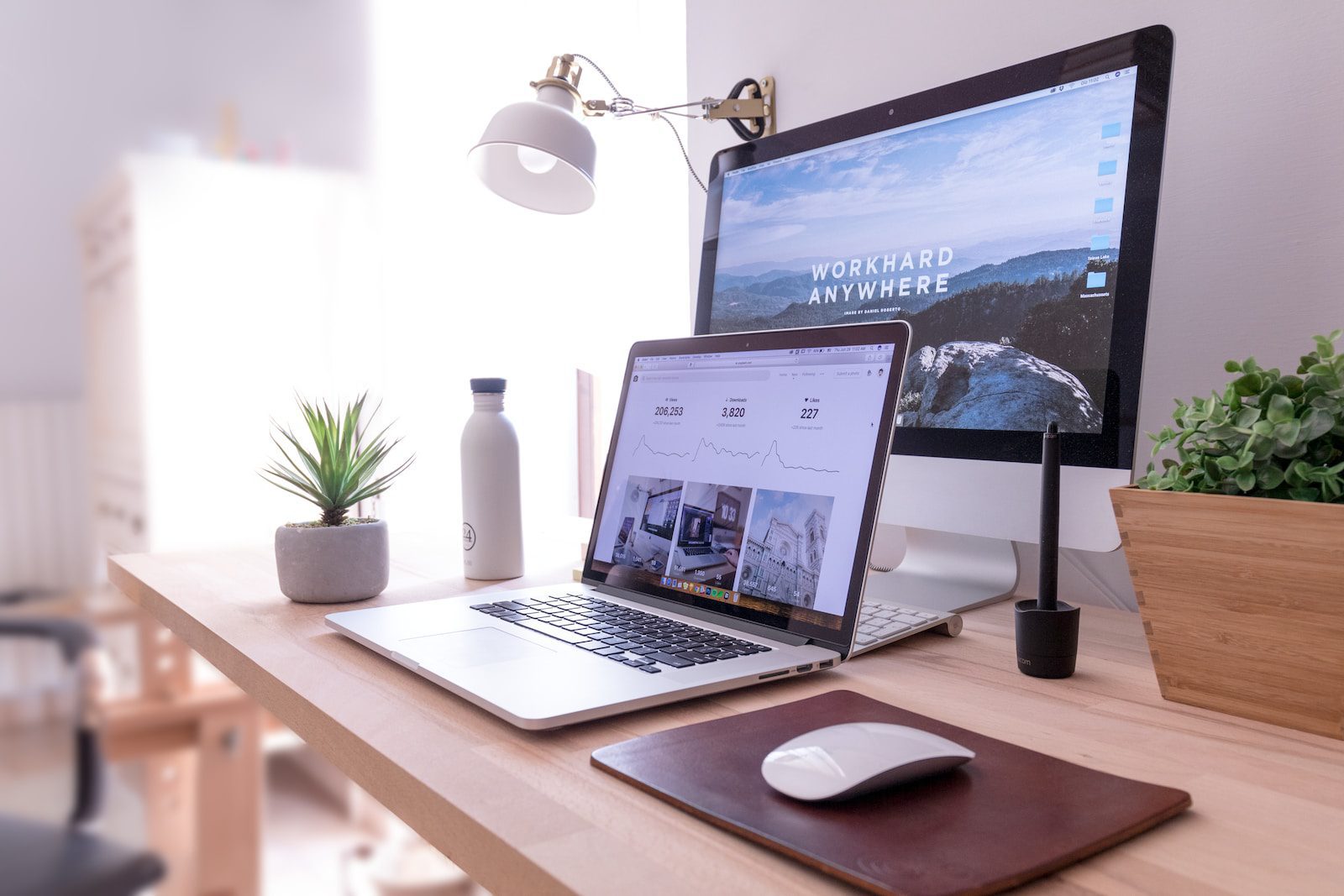
As we step into 2024, the integration of immersive 3D elements is emerging as a game-changer in website design. The days of static, two-dimensional visuals are giving way to dynamic, interactive 3D graphics that captivate visitors. This trend goes beyond mere aesthetics; it creates an immersive experience that keeps users engaged and encourages them to explore your website further.
Imagine a website where users can interact with products in a virtual space or navigate through a three-dimensional environment. Whether it’s a virtual storefront or an interactive portfolio, the use of 3D elements adds a layer of depth that goes beyond the traditional confines of the screen. Embracing this trend not only enhances the visual appeal of your designs but also elevates the overall user experience, making your clients’ websites truly stand out in 2024.
2. Dark Mode Dominance: Stylish and Easy on the Eyes

Dark mode, once a niche preference, is now taking center stage in website design. Beyond being a stylish choice, dark mode offers practical benefits, especially in terms of user experience. It reduces eye strain, conserves device battery life, and provides a sleek, modern aesthetic that resonates with users across various industries.
In 2024, incorporating dark mode into your website designs isn’t just about following a trend; it’s about enhancing usability and visual appeal. When users have the option to switch between light and dark modes, it caters to diverse preferences, accommodating those who prefer a subdued interface and those who favor a classic look. The versatility of dark mode extends to various design elements, from text and icons to images and backgrounds, allowing for a harmonious and visually striking composition. By embracing this trend, you not only keep your designs on-trend but also cater to the evolving preferences of your clients and their audiences.
3. Inclusive and Accessible Design: Everyone, Everywhere
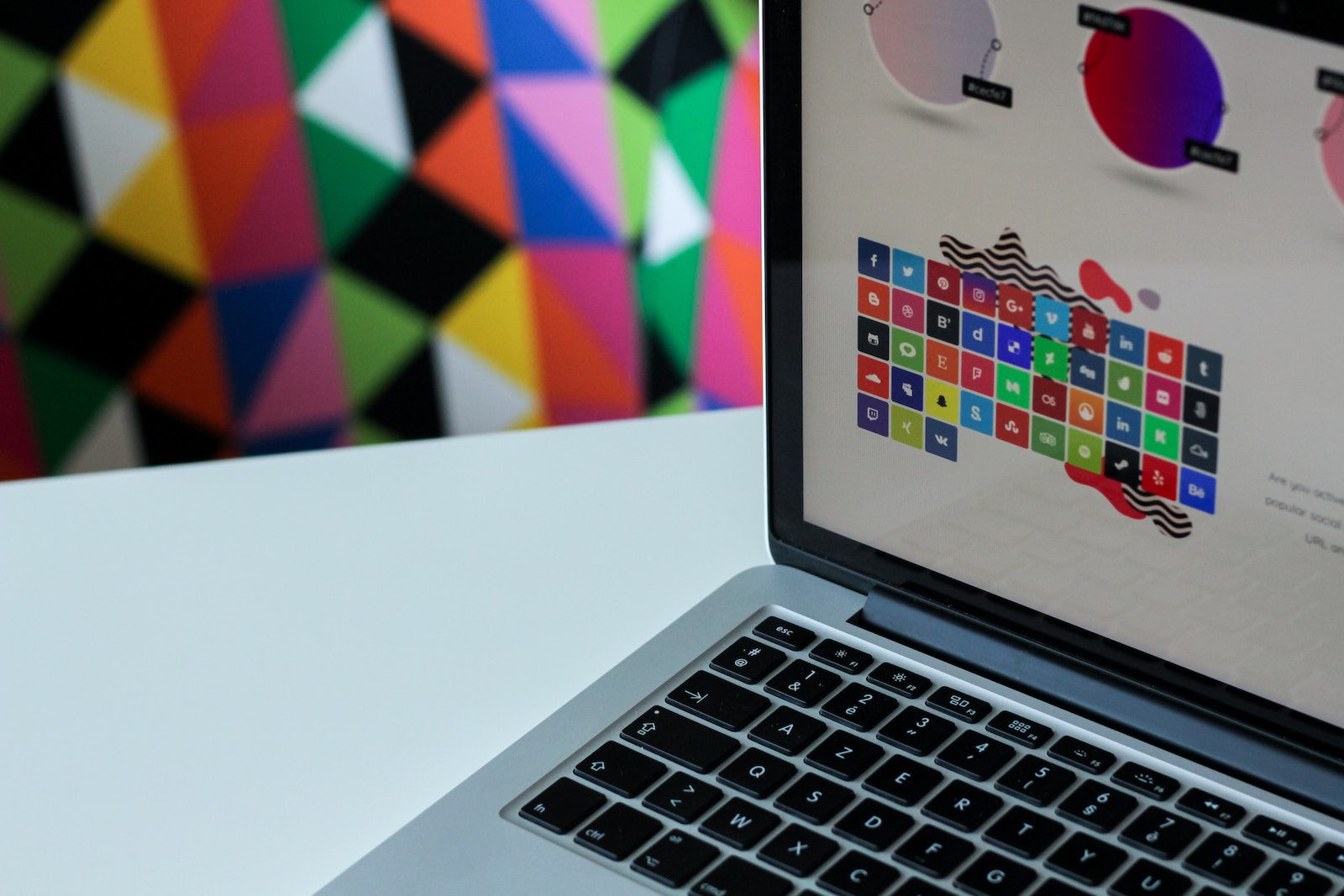
In 2024, the focus on inclusive and accessible design is more pronounced than ever. Websites are becoming powerful tools for connecting with diverse audiences, and ensuring accessibility is not just a trend but a necessity. Designing with inclusivity in mind means creating digital spaces that are navigable by everyone, regardless of abilities or disabilities.
From implementing clear and descriptive alt text for images to ensuring keyboard navigation is seamless, accessible design ensures that your websites are usable by a broad spectrum of users. This not only aligns with ethical design principles but also caters to the growing demand for brands and businesses to be socially responsible. As a designer, incorporating accessible design practices not only future-proofs your creations but also enhances your reputation as a designer who cares about reaching and serving everyone, everywhere.
4. Voice User Interface (VUI): Conversational Experiences

The rise of voice user interfaces (VUI) is transforming the way users interact with websites. In 2024, integrating VUI into your designs is not just a novelty but a strategic move to enhance user engagement. With the increasing prevalence of voice-activated devices, users expect a seamless transition between typing and speaking. Incorporating VUI into your designs allows users to navigate, search, and interact with your website using natural language, providing a conversational and intuitive experience.
Consider implementing voice search functionalities, interactive voice responses, and even voice-activated commands for certain features. This not only caters to users who prefer hands-free interactions but also aligns with the growing trend of integrating technology seamlessly into users’ daily lives. By embracing VUI, you not only stay ahead of the curve but also create websites that are user-friendly and in tune with the way people live and interact in the digital age.
5. Microinteractions: Delight in the Details

In the realm of website design, it’s often the little things that make a big impact. Microinteractions, those subtle animations and responses to user actions, are becoming a hallmark of modern and engaging websites. In 2024, the strategic use of microinteractions is not just about aesthetics but about creating delightful and intuitive user experiences.
Consider incorporating microinteractions that respond to user clicks, scrolls, or form submissions. From a subtle color change when hovering over a button to a smooth transition between sections, these small details contribute to the overall flow and feel of your website. The key is to make these microinteractions purposeful, enhancing usability and providing users with visual feedback. By infusing your designs with these delightful details, you create an immersive and memorable experience that sets your websites apart and leaves a lasting impression on visitors.
6. Sustainability in Design: Green is the New Aesthetic

As environmental consciousness continues to grow, sustainability in design is emerging as a significant trend in 2024. Clients and users alike are increasingly valuing brands and websites that prioritize eco-friendly practices. From using energy-efficient hosting solutions to optimizing website performance for lower carbon footprints, sustainable design goes beyond aesthetics and usability.
Consider incorporating design elements that communicate a commitment to sustainability, such as eco-friendly color palettes and visuals that align with nature. Moreover, optimizing your website’s performance and minimizing resource-heavy features not only align with sustainability goals but also contribute to faster loading times and improved user experiences. As a designer, showcasing your dedication to sustainable design not only attracts environmentally conscious clients but also positions your work as forward-thinking and socially responsible.
7. Hyper-Personalization: Tailoring Experiences to Individuals
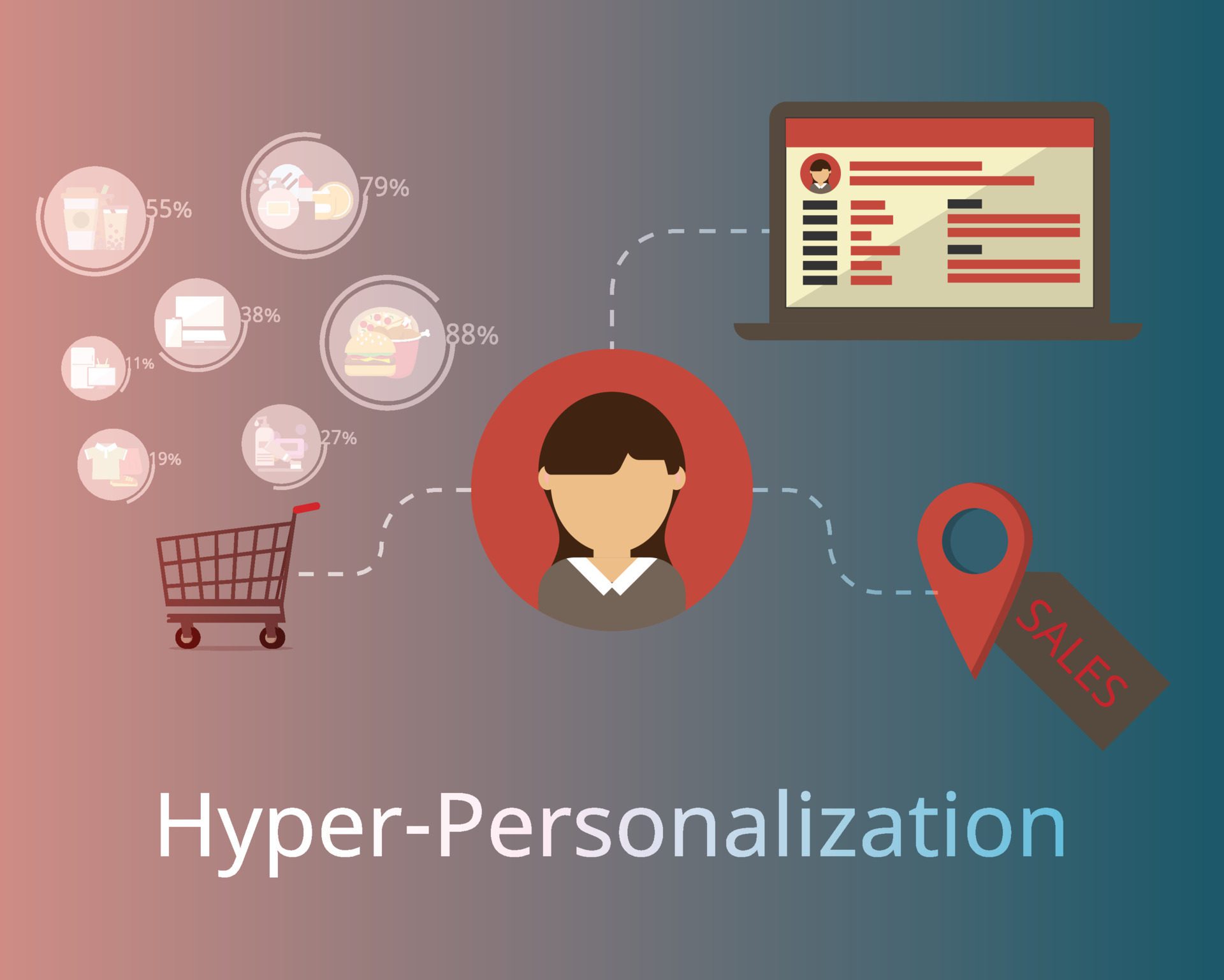
In the era of information overload, users crave experiences that are tailored specifically to their needs and preferences. Hyper-personalization, the art of customizing content and interactions based on user data, is a pivotal trend in 2024. By leveraging data analytics and artificial intelligence, designers can create websites that dynamically adapt to individual users, offering a level of personalization that goes beyond generic recommendations.
Consider implementing features like dynamic content blocks that adjust based on a user’s past interactions, location-based customization, or even personalized landing pages. The goal is to make users feel seen and understood, increasing engagement and conversion rates. As a designer, embracing hyper-personalization not only aligns with user expectations but also positions your designs as intuitive and user-centric in a world where one-size-fits-all experiences are no longer sufficient.
8. Minimalist Navigation: Simplicity in Sophistication
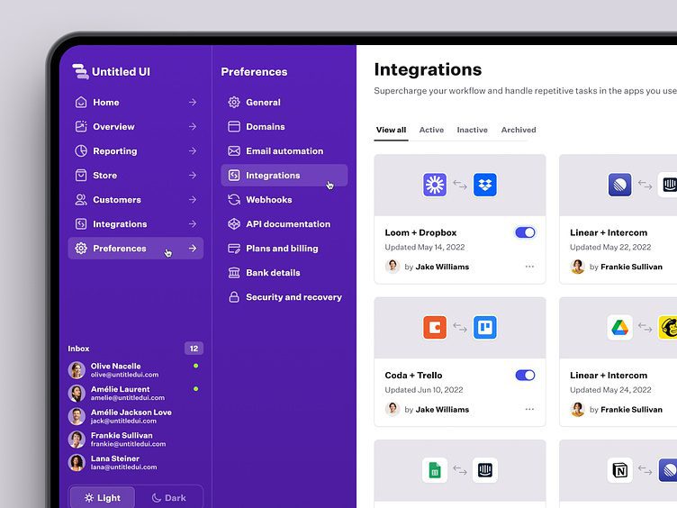
In the pursuit of user-friendly experiences, minimalist navigation is emerging as a dominant trend in 2024. Streamlining navigation not only enhances visual appeal but also improves the overall user experience by reducing cognitive load. By decluttering and simplifying navigation menus, designers can guide users seamlessly through a website, ensuring they find what they’re looking for with minimal effort.
Consider adopting a “less is more” approach to navigation, prioritizing essential menu items and using intuitive icons. Implementing sticky navigation bars or hidden menus can further contribute to a clean and clutter-free interface. The focus is on creating a sophisticated and elegant design that not only looks visually appealing but also enhances usability. By embracing minimalist navigation, designers can create websites that feel modern, intuitive, and in tune with the preferences of contemporary users.
Frequently Asked Questions (FAQ)
What are the essential metrics to monitor in Google Analytics?
Key metrics in Google Analytics include bounce rate, time on page, pageviews, and conversion rates. Additionally, analyze traffic sources, user demographics, and behavior flow. These metrics provide insights into user engagement, the effectiveness of your content, and areas for improvement.
How can I measure the success of my email marketing campaigns?
Success in email marketing can be measured through key metrics like open rates, click-through rates, conversion rates, and the overall growth of your subscriber list. Use these metrics to refine your strategies, test different approaches, and continually improve the effectiveness of your campaigns.
Should I prioritize desktop or mobile optimization?
Both desktop and mobile optimization are crucial. Google prioritizes mobile-friendly sites, but desktop users still exist. Ensure a responsive design that adapts seamlessly to various devices. Regularly test and optimize for both desktop and mobile experiences.
What’s the ideal frequency for updating website content?
Regular updates are essential for SEO, but there’s no one-size-fits-all frequency. It depends on your industry, content type, and audience. Strive for consistency and focus on quality. Monitor engagement metrics to gauge the optimal content update frequency.
Are all backlinks equally valuable?
No, not all backlinks are equal. High-quality backlinks from authoritative and relevant websites carry more weight than low-quality or spammy ones. Focus on earning backlinks from reputable sources within your industry to build credibility and improve SEO.
Can I use the same keywords for every piece of content on my website?
While core keywords may remain consistent across your site, it’s essential to diversify and use variations. Tailor keywords to specific content and audience intent. This approach not only improves SEO but also enhances the relevance of your content to different user queries.
How long does it take to see results from SEO efforts?
SEO is an ongoing process, and the timeline for results can vary. While some improvements may be noticeable in a few weeks, significant changes may take several months. Consistent efforts in content creation, optimization, and link building contribute to long-term success.


